No matter how complicated your monthly cloud bill, all spend in the cloud is premised on a very simple formula:
Cost = Usage x Rate
In simple terms, at any given moment, your cloud cost is determined by how much of a given resource your workloads are using multiplied by the unit cost of using that resource.
There are many different ways to manage the rate you are paying for your cloud resources, from spot instances to on-demand pricing to multi-year reservations. Many solutions have sprung up around helping enterprises optimize the rate at which they are purchasing cloud resources, including various favorable pricing options offered directly by the cloud providers.
However, the more complicated side of the equation is optimizing the Usage factor. Most Platform Engineers have or will experience the cost explosion that can arise from overprovisioning, and the extra time that manual tuning takes—which is time away from higher value engineering activities. Let’s take a brief look at typical problems created when trying to manually optimize usage:
Problem #1: Overprovisioning
If you’re running large batch processes for your big data workloads in the cloud, you have likely run into a common problem: resource overprovisioning. Overprovisioning compute and memory resources—which enables applications to perform in most instances—may appear better than underprovisioning, which can undermine workloads by not providing proper resourcing. However, overprovisioning typically comes with significant resource and cost inefficiencies, especially for unpredictable or bursty workloads. Over time, as costs skyrocket, plans to scale new products or create new solutions can be forced on hold as budgets are overrun or suddenly dry up. And too often, organizations aren’t even aware of the extent to which they are overprovisioned and spending more than necessary.
Problem #2: Manual tuning
No matter how deep the visibility into runtime resource utilization, the volume, variety, and velocity of today’s modern data systems defy manual tuning. The load and available resources in the cloud instance vary as jobs execute and terminate and new ones are run. Your cloud instances can't (and won’t) wait for a person to reconfigure the cluster.
While you and your team can definitely try to manually tune your cloud platform, humans cannot tune in real time, and the total cost of doing so in terms of time and labor (and of course the opportunity cost of spending time on that) is going to outweigh implementing a solution that automates that tuning. With manual tuning, developer time and business resources are redirected from innovative, growth-focused activities to constant tuning and adjustment of the platform for optimal CPU and memory—all while resources are still being wasted due to the unpredictable nature of bursty workloads.
Problem #3: Usage fluctuations
The purpose of autoscaling in the cloud is to enable the automatic addition and removal of instances to match the varying demands of workloads. Cloud autoscalers ramp up rapidly to accommodate peak workload times, but what about ramping down quickly once that peak is over? The autoscaler will be able to keep your applications performant by ensuring more resources are allocated at a peak user time, but often can be slow to downscale once there’s less traffic. For example, if there’s a quick—or unexpected—dropoff in traffic in the middle of the night, a platform team may take several hours to discover the change in traffic, and then be delayed in manually adjusting the resources because they’re simply off work at that time.
3 Solutions to Optimize Usage in your Cost Equation
We’re pretty sure most Platform Engineers don’t want to work weekends and late nights to manage the downsides of overprovisioning. The good news is that Pepperdata Capacity Optimizer is the solution to eliminating the risks of overprovisioning, manual tuning, and usage fluctuation. Here’s how Capacity Optimizer works:
-
-
Real-time tuning
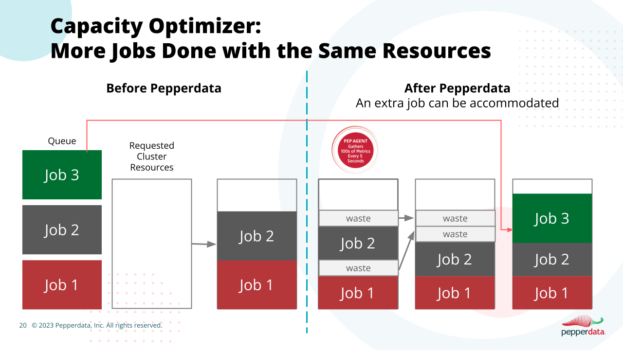
Pepperdata Capacity Optimizer examines all clusters in a cloud environment to identify where more work can be done within a cluster. Based on this insight, Capacity Optimizer directs the scheduler or cluster manager to intelligently schedule workloads based on actual resource utilization. If additional capacity is found, Pepperdata Capacity Optimizer adds tasks to nodes in real time. The result: CPU and memory usage and costs are automatically optimized to increase utilization, enabling all capacity to be used and additional applications to be launched in both Kubernetes and traditional big data environments at the same cost or lower cost, without the need for manual tuning.
-
Continuous monitoring and adjustment of actual resource utilization
Platform engineers don’t need to work late nights or weekends to make sure their workloads are running optimally since Capacity Optimizer runs continuously in your environment. There’s no need for engineers to make application changes when implementing and running Capacity Optimizer; it works seamlessly in the background 24/7 to monitor and adjust your resources to actual levels of resource utilization. Capacity Optimizer ensures the right amount of resources are being used for each job at all times.
-
Augmented Autoscaling
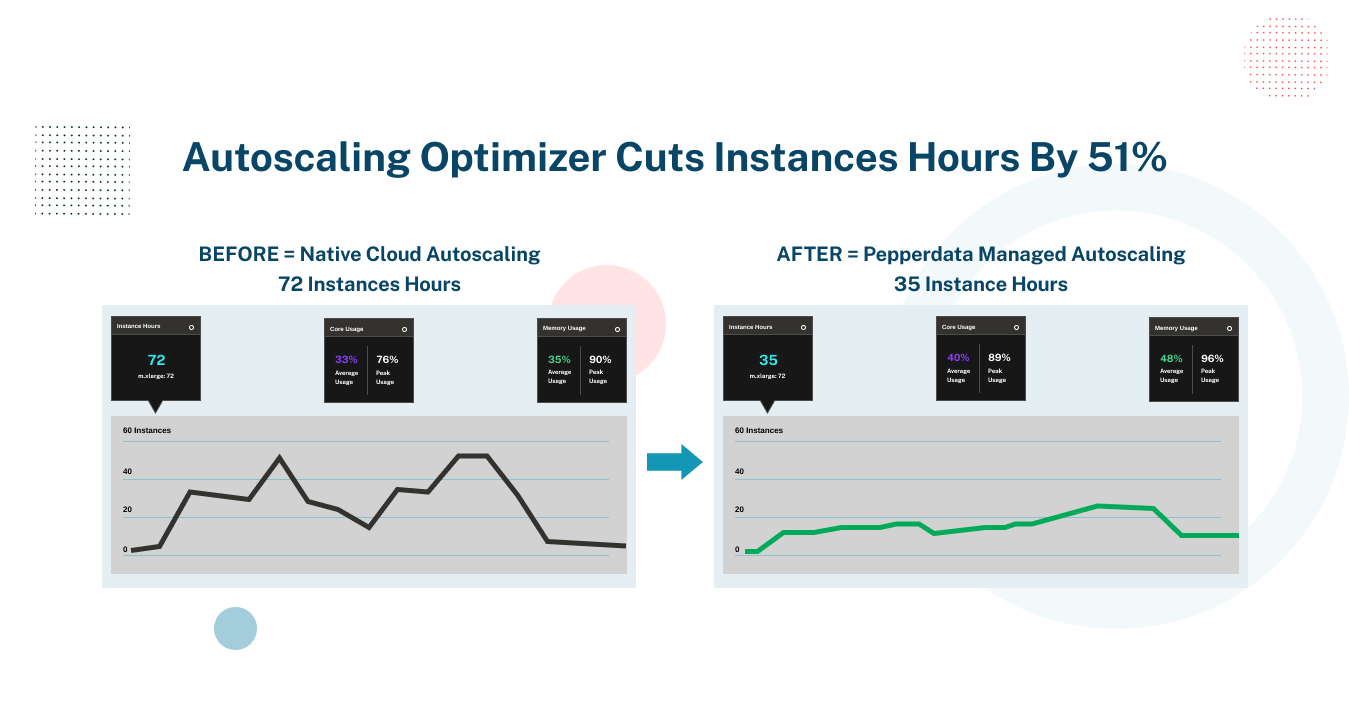
With Pepperdata Capacity Optimizer, your applications can be deployed and run with automatic resource provisioning. This means your environment will be managed automatically to peak utilization at all times, which optimizes both your costs and your team resources (see chart above). There’s no more need for monitoring your autoscaler; instead, your developers can focus on creating and optimizing innovative apps to further the business. Because Pepperdata manages your autoscaling in real time, your usage is always maintained at the optimal sweet spot—never overprovisioned or underprovisioned.
-
Short-term and Long-term Savings with Pepperdata Capacity Optimizer
As you can see, Pepperdata Capacity Optimizer offers industry best practice results for real-time, automatic, and continuous cloud cost optimization. By automatically addressing the optimal number of instance hours needed within your big data infrastructure, Capacity Optimizer enables you to realize both short- and long-term positive economic benefits by simply pressing our “easy button.”
Short term
With Pepperdata, optimization of your cloud infrastructure is immediate. Once installed (which typically takes less than an hour in most enterprise environments), Pepperdata Capacity Optimizer immediately optimizes the price to performance ratio of your application environment. This allows you to reduce costs while freeing up engineers to focus on other immediate higher value priorities within your business.
And while some companies have had to repatriate workloads back to their on-premises infrastructure because cloud costs had risen so high, with Pepperdata you can continue maximizing the price/performance and deployment benefits that cloud platforms like Amazon EMR offer.
Long term
Capacity Optimizer will reward you with year-over-year compounded optimization savings that you may have not yet experienced in the cloud. In addition to the direct cost savings based on instance utilization, you can also redirect your engineering resources from the tedium of manual tuning to higher value-add functions, like developing improved applications and solutions for your business—translating into more innovative revenue opportunities. Especially with unforeseen circumstances like recessions or revenue downturns, the compounded savings from Capacity Optimizer will lead directly to more savings in the bank. All of this with just the simplicity of the Capacity Optimizer “easy button.”
Next Steps to Get Started
Pepperdata helps you extract the most from your cloud environment, whether it be reduced costs or increased capacity—all delivered autonomously, continuously, and free of any requirements for upfront modeling or code changes to your applications.
You can explore the concrete benefits of Pepperdata Capacity Optimizer in your environment with just a few steps:
- Step 1: A guided Pepperdata install to profile your workloads: Usually less than 60 minutes in most enterprise environments
- Step 2: Run Pepperdata in the background for 15 days to gather insights, all the while running your workloads as normal
- Step 3: Receive your Free Pepperdata Cost Savings Assessment and ROI report: ~60 minutes
Click here to get started on a Free Pepperdata Capacity Optimizer Proof of Value!
If you’d like to learn more, please also be sure to check out our Pepperdata for Amazon EMR datasheet.


